FORCE OF NATURE
The flora comes first at a leafy enclave just minutes from downtown Palo Alto.
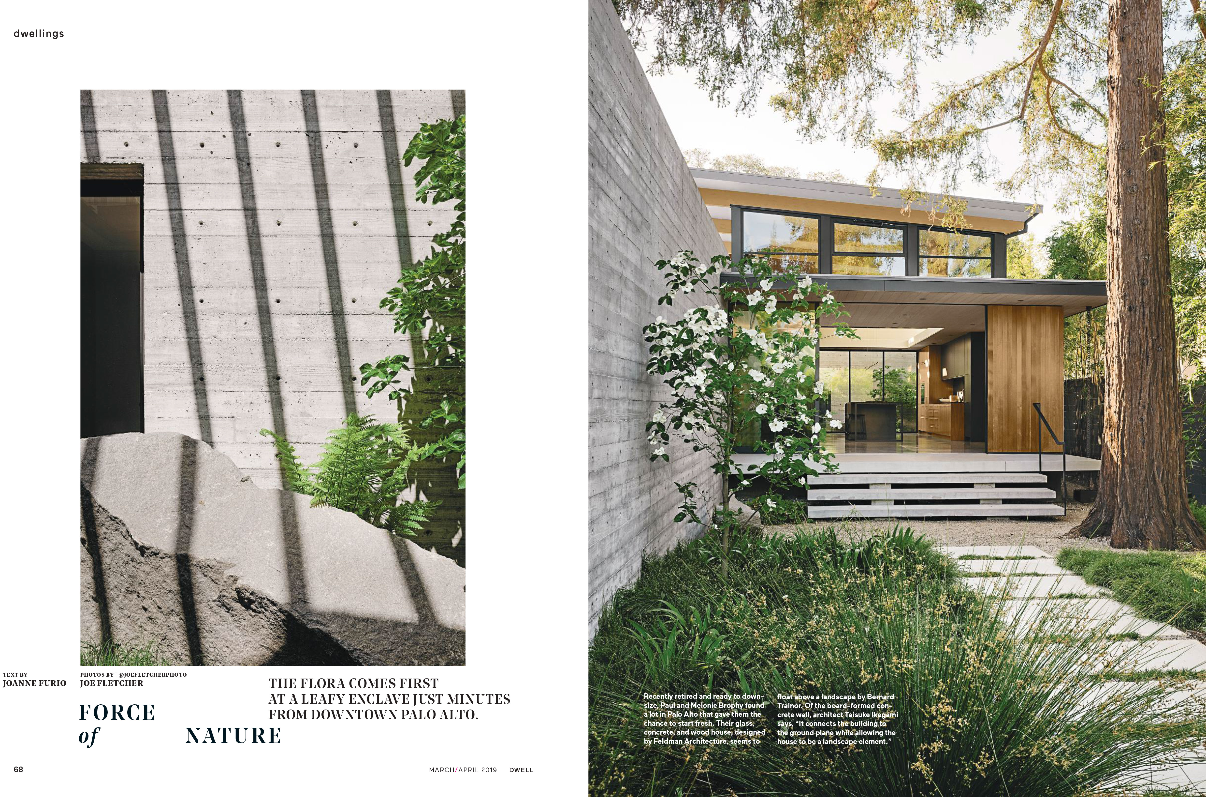
Recently retired and ready to downsize, Paul and Melonie Brophy found a lot in Palo Alto that gave them the chance to start fresh. Their glass, concrete, and wood house, designed by Feldman Architecture, seems to float above a landscape by Bernard Trainor. Of the board-formed concrete wall, architect Taisuke Ikegami says, “It connects the building to the ground place while allowing the house to be a landscape element.”
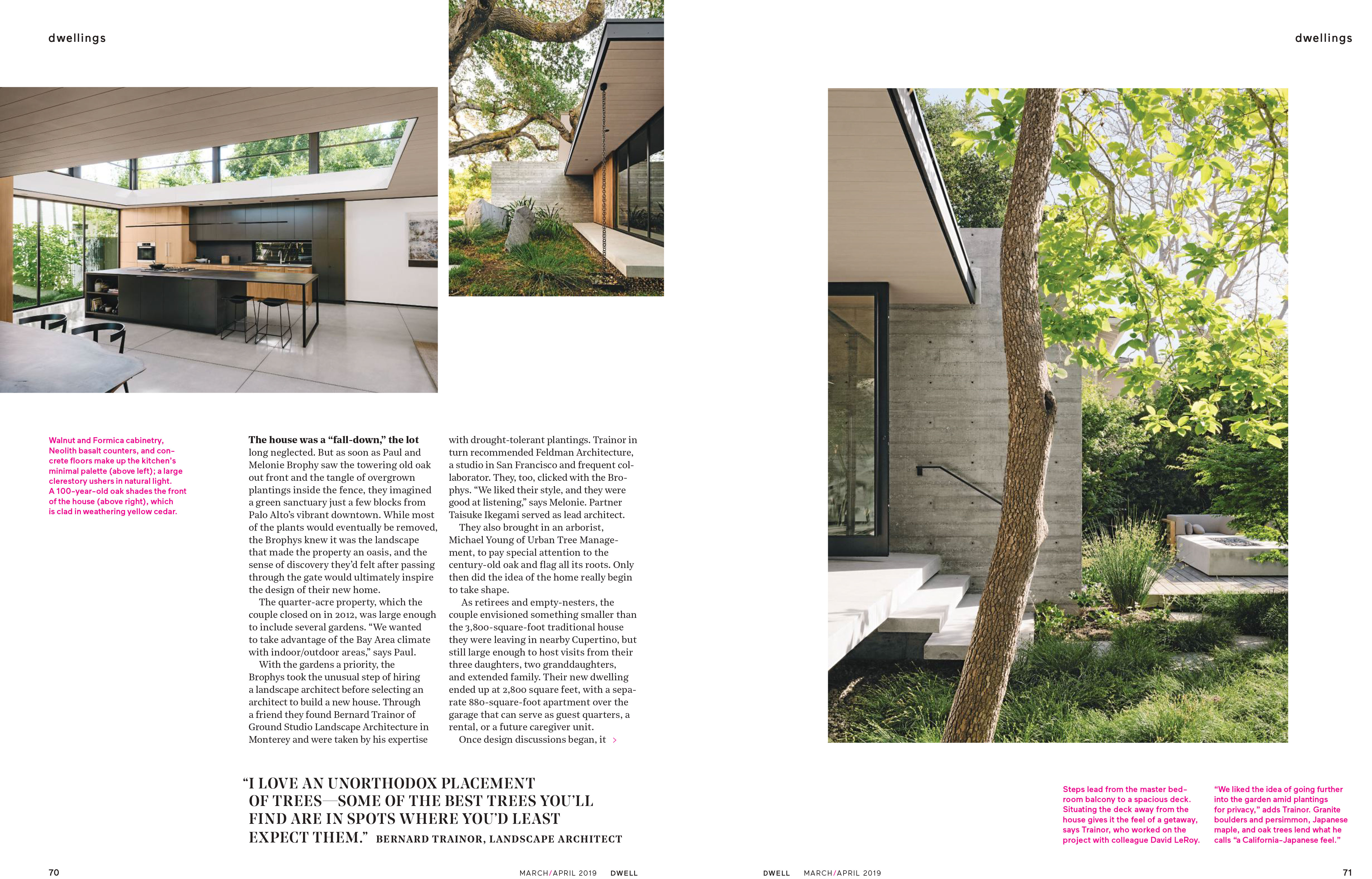
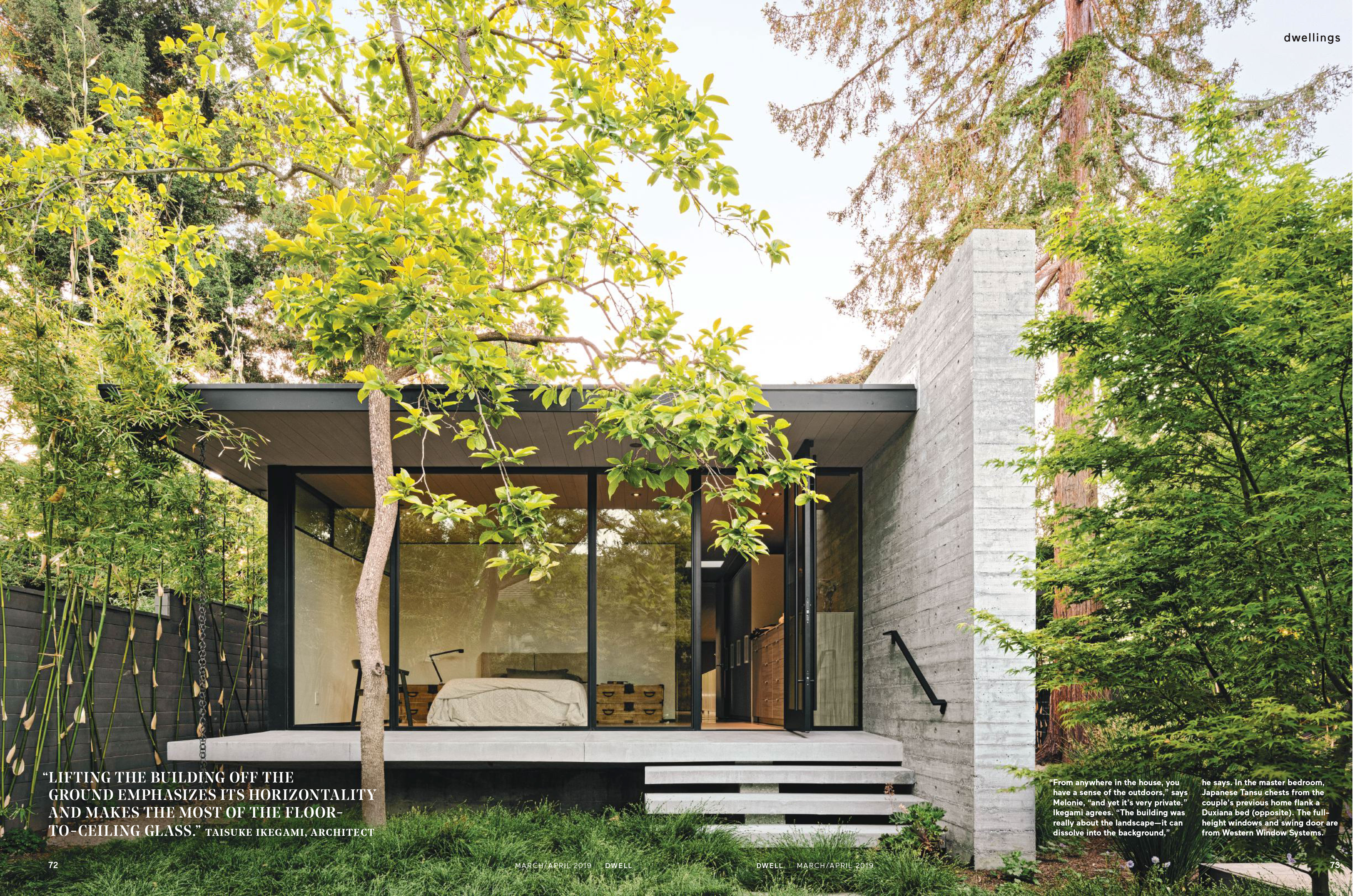
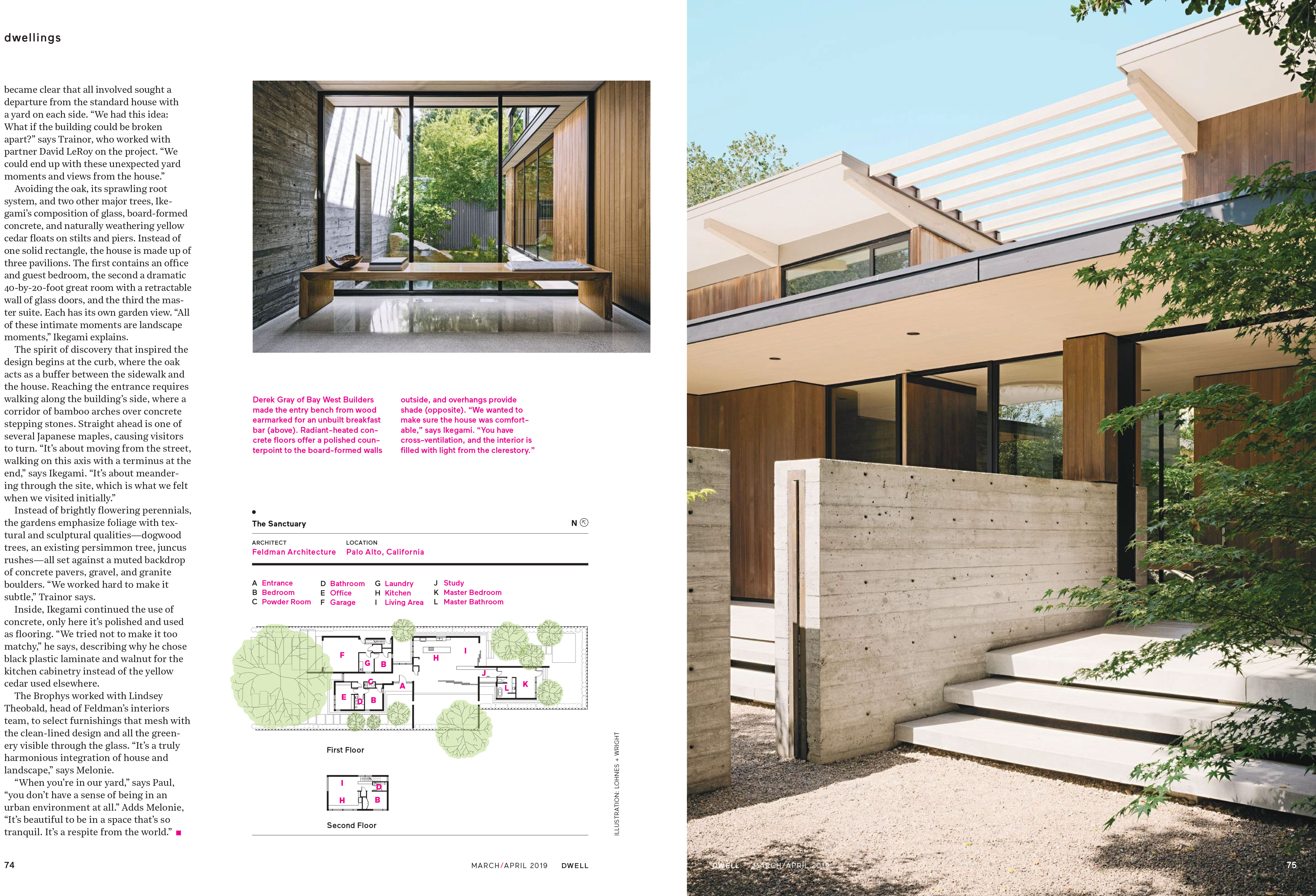
The house was a “fall-down,” the lot long neglected. But as soon as Paul and Melonie Brophy saw the towering old oak out front and the tangle of overgrown plantings inside the fence, they imagined a green sanctuary just a few blocks from Palo Alto’s vibrant downtown. While most of the plants would eventually be removed, the Brophys knew it was the landscape that made the property an oasis, and the sense of discovery they’d felt after passing through the gate would ultimately inspire the design of their new home.The quarter-acre property, which the couple closed on in 2012, was large enough to include several gardens. “We wanted to take advantage of the Bay Area climate with indoor/outdoor areas,” says Paul. With the gardens a priority, the Brophys took the unusual step of hiring a landscape architect before selecting an architect to build a new house. Through a friend they found Bernard Trainor of Ground Studio Landscape Architecture in Monterey and were taken by his expertise with drought-tolerant plantings. Trainor in turn recommended Feldman Architecture, a studio in San Francisco and frequent col-laborator. They, too, clicked with the Bro-phys. “We liked their style, and they were good at listening,” says Melonie. Partner Taisuke Ikegami served as lead architect. They also brought in an arborist, Michael Young of Urban Tree Manage-ment, to pay special attention to the century-old oak and flag all its roots. Only then did the idea of the home really begin to take shape. As retirees and empty-nesters, the couple envisioned something smaller than the 3,800-square-foot traditional house they were leaving in nearby Cupertino, but still large enough to host visits from their three daughters, two granddaughters, and extended family. Their new dwelling ended up at 2,800 square feet, with a sepa-rate 880-square-foot apartment over the garage that can serve as guest quarters, a rental, or a future caregiver unit. Once design discussions began, it became clear that all involved sought a departure from the standard house with a yard on each side. “We had this idea: What if the building could be broken apart?” says Trainor, who worked with partner David LeRoy on the project. “We could end up with these unexpected yard moments and views from the house.” Avoiding the oak, its sprawling root system, and two other major trees, Ike-gami’s composition of glass, board-formed concrete, and naturally weathering yellow cedar floats on stilts and piers. Instead of one solid rectangle, the house is made up of three pavilions.The first contains an office and guest bedroom, the second a dramatic 40-by-20-foot great room with a retractable wall of glass doors, and the third the mas-ter suite. Each has its own garden view. “All of these intimate moments are landscape moments,” Ikegami explains. The spirit of discovery that inspired the design begins at the curb, where the oak acts as a buffer between the sidewalk and the house. Reaching the entrance requires walking along the building’s side, where a corridor of bamboo arches over concrete stepping stones. Straight ahead is one of several Japanese maples, causing visitors to turn. “It’s about moving from the street, walking on this axis with a terminus at the end,” says Ikegami. “It’s about meander-ing through the site, which is what we felt when we visited initially.” Instead of brightly flowering perennials, the gardens emphasize foliage with tex-tural and sculptural qualities—dogwood trees, an existing persimmon tree, juncus rushes—all set against a muted backdrop of concrete pavers, gravel, and granite boulders. “We worked hard to make it subtle,” Trainor says. Inside, Ikegami continued the use of concrete, only here it’s polished and used as flooring. “We tried not to make it too matchy,” he says, describing why he chose black plastic laminate and walnut for the kitchen cabinetry instead of the yellow cedar used elsewhere. The Brophys worked with Lindsey Theobald, head of Feldman’s interiors team, to select furnishings that mesh with the clean-lined design and all the green-ery visible through the glass. “It’s a truly harmonious integration of house and landscape,” says Melonie. “When you’re in our yard,” says Paul, “you don’t have a sense of being in an urban environment at all.” Adds Melonie, “It’s beautiful to be in a space that’s so tranquil. It’s a respite from the world.


